Looking back in April 2021, I decided to join the Google UX Cetificate grogram on Coursea. I have completed a major milestone in having my first UX project for the course to showcase. In this post, I will walk you through the process that I personally experience and share what I would do differently, if I were to start over agian.
1. Choosing the challenge
First thing first, deciding which challenge to tackle. In the course, there is a plugin from Sharpen, an organization that creates randomized design challenge exercises. The format of the prompts from Sharpen match interview questions that real hiring managers use to assess candidates for jobs in UX design.
In my case, I choose to design a mobile app for local donut shop in the Bay Area, called Golden Dontus.
2. Project overview
Golden donuts is a local donut shop locates in the suburbs of a metropolitan area. Golden donuts strives to deliver local taste in donuts and pastries. They offer a wide spectrum of competitive pricing. Golden donuts target customers like commuters, workers, individuals and families who crave for donuts.
Project goal – design an app for Golden Donuts that allows users to easily order and pick up donuts and pastries.
3. Understanding the user
The next step in the design process is to understand the user. I have conducted interviews and created empathy maps to understand the users. I’m designing for and their needs. A primary users group identified through research was working adults with and without children, who usually don’t carry cash.
This user group confirmed initial assumptions about Golden Donuts customers, but research also revealed that carrying cash was not the only factor limiting users from stopping by the shop. One problem is slow service because there is one person works at the store. Other problems that customers don’t carry cash are time, ATM location and especially with COVID-19 in place. People are hesitant to even touch money.
The next step is to create user research pain points, persona and user journey map.

4. Starting the design
The design stage starts with paper wireframes, digital wireframes, low-fidelity prototype and end with usability studies.
Paper wireframes – I took the time to draft iterations of each screen of the app on paper ensured that the elements that made it to digital wireframes would be well-suited to address user pain points.
Digital wireframes – as the initial design phase continued, I made sure to base screen designs on feedback and findings from the user research.
Low-fidelity prototype – using the completed set of digital wireframes, I created a low-fidelity prototype. The primary user flow I connected was browing and viewing menu and items, so the prototype could be used in a usability study.
Usability study – I conducted two rounds of usability studies. Finding from the first study helped guide the designs from wireframe to mockups. The second study used a high-fidelity prototype and revealed what aspects of the mockups needed refining.

5. Refining the design
After analysis of usability findings, I started working refining the design. First, adding color and images to the low-fidelity design to give life to the mockups. Then adding more details based on the second round of findings.


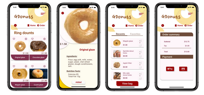
High-fidelity prototype – the final high-fidelity prototype presented cleaner user flows for viewing items with the added to the bag button. Check out the prototype here.

Accessibility considerations – add alt text to images for screen reader. Follow Web Accessibility Guideline on color contrast. Increase font size and white spaces for readability.
6. Going forward
Takeaways – the app makes users feel like Golden Donuts thinks about how to meet their needs. While designing the Golden Donuts app, I learned that the first ideas for the app are only the beginning of the process. Usability studies and peer feedback influenced each iteration of the app’s design.
Next steps – incorporate P2 insights into the design. Conduct another round of usability studies to validate whether the pain points users experienced have been effectively addressed. Conduct more user research to determine any new areas of need.
Thank you for time and if you more time, you check out my UX design portfolio.
Good luck!


Leave a comment